
Do you know that heavy text clutter can drive readers away from your content?
Whether it’s a post, carousel, or video caption, crowded text tires the eyes, regardless of how compelling the points are.
That’s where white space shines; it creates breathing room around text, images, or other elements, which improves clarity, readability, and guides viewers’ attention.
In this post, we will reveal the power of white space and its role in enhancing communication.
You’ll learn how white space can make your content easier to read, more inviting, and cleaner.
What Exactly Is White Space?
Also known as negative space, white space refers to the empty space surrounding your text.
It’s like pausing a conversation to give your audience room to think. They are used in between paragraphs, line spacing, margins, buttons, and visual sections.
While white space can be any color, the name originates from the traditional white background design of printed materials.
White Space Examples Across Different Content Types
- In a blog post, white space can be wide margins around text.
- In social media, white space around text highlights the key point
- In videos, without white space, thumbnails and graphics will be crowded, drawing attention away from the focal point.
- In newsletters, white space refers to the gaps between sections in an email body.
What’s special about white space?
- It makes your content easier to read
- It guides the reader’s attention
- It aids your content format, making your content skimmable
- It makes reading more enjoyable.
Learn 10 Formatting Tips to Boost Your Content’s Readability.
White Space Made Simple
Here’s how to use white space in various forms of content types.
1. Blogs and Other Text Posts
Enhance readability and comprehension by adding white space to your text-based content.
- Avoid long paragraphs; keep to 2–4 sentences.
- Add line breaks to separate ideas.
- Use subheadings to segment each section.
- Use lists or bullet points for key messages.
- Leave space around images(before and after).
2. Social Media Posts (Both Text or Graphics)
Use white space to make your posts scannable and appealing.
- Use short line captions.
- Where applicable, add emojis as separators or visual cues.
- Leave spaces around edges, don’t crowd it with text.
- In images, place text in the center and leave space around it.
- Keep only a few key points per image
3. Video and Thumbnails
Spacing in visuals keeps your viewers focused on your key message.
- Move text and logos away from the edges.
- Stick to simple backgrounds to make your message pop.
- Use limited text on each frame.
Also Read: Simple Tips on How to Create Thumbnails and Headlines
4. Newsletters/Emails
White space makes emails more readable on all devices, both mobile and desktop.
- Use single-column layouts (one continuous column) from top to bottom.
- Give space between headings, paragraphs, and any included visuals.
- Add a clear call-to-action.
Related Post: A Guide to Understanding Different Content Types
Mini White Space Checklist
Before you publish your next content, use this checklist for a quick self-audit
- Paragraphs: Are they between 2 – 4 lines?
- Line Breaks: Does your caption or blog have natural pauses (like a breathing pause in a conversation)?
- Margins: Is there space around images?
- Mobile-Friendly: Does the spacing look good on mobile devices?
- Main Point: Can you quickly spot the key message if you squint your eyes?
If your answer is mostly “yes” to these, your white space is working.
See 10 Simple Strategies to Improve Readability and Boost Engagement.
Real-Life Examples of White Space Done Right
Let’s see a few examples of brands and platforms and how they use white space to make their message clearer:
1. Blog Example: HubSpot Blog
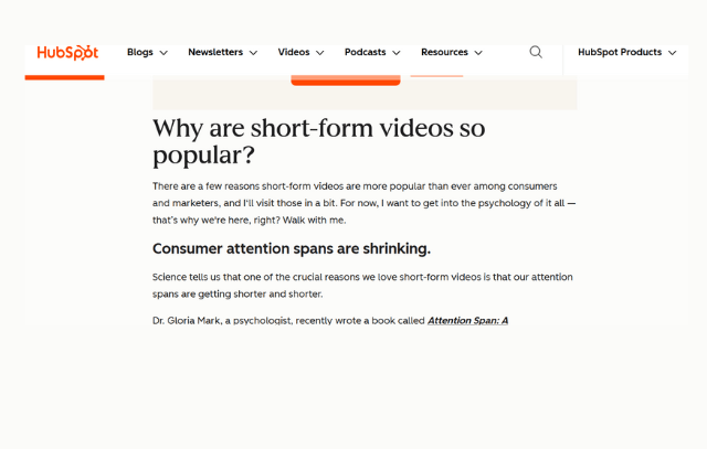
This HubSpot article is concise and easy to scan through. You can also go through different sections without reading everything.
2. Social Media Example: Copyhackers on Instagram
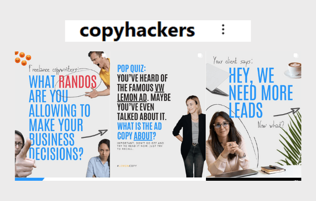
Notice the breathing room in the images. The text is concise, making it easy to understand the message.
3. Newsletter Example: Neil Patel
SEO and Content marketing: Neil Patel’s newsletters are skimmable in under 2 minutes.
They are straight to the point, with clear links and CTAs, and key points well spaced out.
These content types are only examples; even WhatsApp chats require white space, especially when they are long.
Related Post: Effective Content Distribution Strategies
White Space is not Merely Empty Space
White space is much more than aesthetic; it is a simple tool that makes your message clearer.
From videos to newsletters, understanding the power of white space will make your content shine.
Segment your ideas, don’t overcrowd your post or images with text, and you’ll give your viewers eye relief.
Check one of your old posts today, it might just need some white space update.

Leave a comment